Thursday, September 27, 2012

Interior Design is so much fun


Whenever I tell people I am an Interior designer, they all say  "your job is so much fun" and it is, especially when I get to see new collections. 

I recently previewed the  Fall  Phillip Jeffries  Passport Collection.  Phillip Jeffries is a leading wall paper manufacturer of natural, textured and specialty wall coverings.
While the collection was being released, I was meeting with Connie their NC rep and received a personal presentation of the new Passport Collection.  I have to say, it's ABSOLUTELY Beautiful! I think the graphics and the pallettes are very chic.  I hope you will visit their website and fall in love with the unique "boldly scaled designs" of the Passport Collection.

Passport Collection


I'll share a few of the papers I fell in love with.

IMPERIAL GATES 
This was one of my very favorites, the color below is Dove & Taupe and this paper is available in 9 colorways.  I like the color palette and the bold graphics, it's classic yet contemporary


BOHEMIAN BANGLES is a series of large circles with each circle being 9.75".

            BOHEMIAN BANGLES 


CHINOIS OUR WAY  I love the updated look given to the Chinoiserie paper, the color combinations are just spectacular.


TEASE

Phillip Jeffries
         I loved the colors, crisp and fresh.
 
Tease is available in 9 colorways and is printed on Linen, Jute  and Manilla Hemp.

The paper is hand printed by Artisans in the US for a "unique handcafted effect".


CHAIN LINK  is available in 13 Colorways.  When I saw the orange photograph of Chain Link, I was reminded of a recent article I read that said Orange was the hottest color in the South East.


The papers are printed on natural fiber and therefore create a hand stenciled look with slight variations in the texture and color.  These variations are to be expected and are part of the natural beauty of handprinting on natural wallcoverings.  The art of hand-printed wallcoverings is what makes the papers so special.

By the end of our meeting, I just could not decide which one I liked best.  They are all so beautiful!  
Thank you Connie for sharing the Passport Collection from Phillip Jeffries with me.

I hope you love this collection as much as I did.  I can't wait to hear what you have to say.   Is there a particular paper you fell in love with? Let us know and share with us as to why it excites you.   

What's not to love about my job, I get to work with great people and share  the beautiful creations  available to all of us.  
                                                                        

Friday, September 7, 2012

DIY Secrets as seen in the Charlotte Observer


                  Thank YOU Charlotte Observer


                                                     Preserved Botanical Arrangements


 It's not everyday you get published in your local paper, but I was certainly thrilled to see my article featured on the top fold of September 1st Home & Garden section.
They called a few weeks ago and asked a couple of questions, if you didn't get a chance to see it in the paper,  I will share them with you.

What is your DIY secret weapon?
My DIY Secret weapon is always a great flower arrangement.  Whether as a centerpiece in a dining room or on a table in any room, flowers breath life and color into a space.  An elegant orchid placed in a beautiful container, an arrangement of fresh roses from your garden or preserved botanicals, I love bringing the outdoors in, adding life to every room.


These roses actually came from my garden and not only do they look beautiful, they also smell lovely.


There are two arrangements used in this dining room, the first is on the right and it's just a great looking large glass container with an over sized leaf and fabulous ornamental twigs.

The arrangement featured against the wall was made in a great looking copper pot and it is filled with a combination of herbs and plants and accented with a white pumpkin and great vine.   Always look for the best container, bring the outdoors in and let your imagination go. 

Take your room to the next level, it's all in the finishing touch.
If you find yourself out of great ideas, I am happy to help you.

To read the article visit Charlotte Observer

Wednesday, June 27, 2012

Grey, the new neutral


As I was sitting on the beach over the weekend, I was in awe of how nature is such an inspirations in design. 

The color palette around me was amazing.  Sea weeds had washed up on the beach and in late afternoon light was bouncing everywhere. 


The Dijon color of the seaweed against the gray beach with blues and greens reflecting from the water were just beautiful.   There were splashes of white as the water rippled in.  The white was subtle yet striking.

GREY is the new neutral
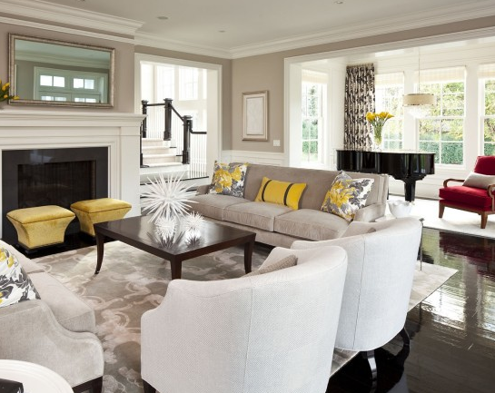
I wanted to share with you how adding a touch of a color to a neutral pallette can liven up a space and turn a room into a beautiful and fun place.  Grey is not limited, it can read contemporary or transitional.  It's all how you pull it together.


In the photo below Jennifer Brouwer did a beautiful job in this living spaces combining different shades of grey in solids and textures and adding that POP of sunshine.  As on the beach, you see the touches of white in the wooden blinds, the lamp shades, vases and base boards that all play their part in bringing the room together. 


Why this room works:

Again, we see a beautiful example of how that pop of sunshine whether it be Dijon, yellow or mustard combined with the neutral greys and the balance of white complement each other.  The dark woods of the floor and furniture set the stage and allow light to dance around the room.  I think Martha did a beautiful job in this room and I especially like the unexpected red chair by the piano.


As I stood up to take pictures, I could not help but realize how even my fuchsia beach chair just POPED against the grays and mustard's. 


When I came across Niki's photo, I thought VOILA how cool!
I love the way the Fuschia accents on the back of the book shelf and the club chairs add so much fun to a room.

Add color to your life, it's a sure way to put a smile on your face.

Share some of your thoughts or pictures of a grey and a pop of color with me, I'd like to smile

Wednesday, June 6, 2012

Create Wall Chic with Art Galleries


One of the hottest trends in home decor is creating spectacular walls with an      Art Gallery picture arrangements.

 If your wondering how designers do it.  I'm going to share a few tips to help you create Wall Chic!

Planning is key!
Don't start hammering right away or you'll have too many holes and an uneven, imbalanced display of art.  Find the right size wall for the right pieces.  Measure it out so you know the amount of space you are working with.  Remember, AVOID direct sunlight.

Personalize your home by showcasing the things you love
Begin by selecting the pictures, art or mementos you would like to group together.  Create a story or grouping of pictures and artwork that share something in common.  Grouping collections of photos and art tend to add interest.  It's all about BALANCE not just the SIZE of the artwork

Arrange   Arrange all of your pieces on the floor
You want to create balance as well as a story.  Lay them out on the floor  placing the largest piece in the center as the focal point and work out.  The center piece should be hung  60-65" off the floor to the center of the artwork.  Other pieces will hang lower and higher depending on the look you want.   It is really helpful to make a note of the distance between each picture and that should not exceed 5".  If your hanging pieces over furniture, leave at least 8" between the bottom of the frame and your furniture

Now, take a step back and admire!

*The arrangement should read as one piece,  something like putting a jigsaw puzzle together


Here are a few of my favorites,
 what I love about them and why they work

I started with Pinterest  http://pinterest.com/rosadest/great-wall-ideas/# and had to stop before I got a little carried away.

I love this wall color, it adds drama and really lets the black and white photographs POP.

Great Walls on Pinterest

This black and white wall gallery by Charlotte Moss shows great balance of frame sizes


If you love symmetry, this arrangement is for you.  By placing the largest piece in the center and the botanicals symmetrically placed on either side create a wonderful story on this Southern Accents wall.


This stairway gallery reflects the homeowners taste in art and personality


This photograph from Southern Accents is the quintessential balance of color and symmetry
 

The photograph below shows a unique way to create a wall gallery using a rod and hanging the paintings, black & whites and pencil drawings from either small chains or coils as you see in museums


Monday, May 21, 2012

Blogfest 2012

Blogfest 2012 has started with a bang. An exhilarating yet exhausting day.
Our day began with a preview party to the Kip's Bay decorator show house www.kipsbaydecoratorshowhouse.org/visit. Widely regarded as one of the most prestigious interior design show houses.
From Kips Bay we went to the Savant Experience center, designed by Thomas and featuring Apple based control and automation technology. Sorry to say my phone/camera died after Kips Bay so I don't have any photos of this incredibly techno cool place. See it on line http://www.savantsystems.com/nyc_experience_center.aspx
Oh the night is still young, from there to an exclusive after party at the Savoir showroom where I was so ready to just lay down and crash for the night. www.savoirbeds.com/. I just wish I could have laid down on one of their wonderful beds
So from the city that never sleeps, good night.

Monday, April 30, 2012

A Star Studded Week


Wow, what an awesome week for a designer in High Point. I've been going to HP twice a year now for 12 years and never have I been so privileged to meet some of the top designers in the US.


Alexa Hampton

My day began by  meeting Alexa Hampton, who was just a delight.  She has a way of making people feel very comfortable, just like her designs.
Alexa Hampton

Alexa has a line of furniture for Hickory Chair Furniture based on reinterpreted historical pieces and known for  making classic designs comfortable.

Photograph by Rosa Dest Interiors with her line of furniture


Susan Hable


Read more about Susan Hable and Hable Construction

Susan,  is the first textile designer that Hickory Chair Furniture has ever used to develop  a line for them. 


Her textile design firm offers clean, simple silk screening and domestic manufacturing.

This was one of my favorites of her fabric combinations, I love the use of textures combining cut velvets and silks.  The paintings are original water colors by Susan.


I've had the pleasure of meeting Suzanne twice and although she may never remember me, I will never forget her.  I first met her at the Brunschwig showroom in Charlotte, NC where she was debuting her fabric line for Lee Jofa and then last week at Hickory Chair.  She is charming and so enthused about her lines of fabric and furniture.


I took this photograph at the Hickory Chair showroom,where you can see her beautiful line of furniture and fabrics.  Suzanne mixes both antique and modern pieces to create a timeless environment.


Merging traditional with modern, Thomas O'Brien uses  textures and colors not prints to merge cool and warm creating an evolving feeling.  He likes his rooms to "Not look decorated", "love it and let it be" is what he feels a home should be.

Thomas O'Brien for Hickory Chair


Barclay Butera, "Furniture does not make a home, Life does"     
I love his quote, it resonates in my practice of design.  "Design is the way you present your lifestyle to the world".


I feel like I hit the jackpot last week at High Point, not only getting to meet these fabulous designers but also learning about their lines, their inspirations and what drives them.
A big thank you to Laura Holland of  Hickory Chair for taking time during market to reacquaint me with your company and beautiful furniture.


Wednesday, April 18, 2012

Spring in the Carolinas


              Spring in the Carolina's

 You could say I've been on spring break or a bloggers vacation, or simply been   to  busy to blog.  All of the above are true, so I'll ease into blogging by sharing the beauty of spring in the Carolina's.

Spring came early to Charlotte and with a big welcome.  I look so forward to spring despite the pollen that comes with it; the air is fresh, the colors are lovely and Charlotte looks spectacular!
There's  nothing more beautiful to me  than to look outside my windows and see the beauty of nature.  This Varnadoe pink Azalea has moved with me from two different locations.  It is the one plant in my garden I get the most excited to see bloom.

Varnadoe pink Azalea

The roses are in their glory!  I could not do it alone and if it weren't for Robert from The Perfect Rose, I would not enjoy the bounty of roses that bloom from March through November in my garden.


As an interior designer, I find it imperative to have the exterior of the home enhance the interiors.  Remember, it is the exterior we see first.   The colors seen through your windows should complement the colors inside your home.


  Charleston Home & Garden Tour
  Charleston, SC was in it's glory during the Charleston Home & Garden tour in March.  Make plans to attend next years garden tours.  You will be very happy you did.
 
     
These are just a few shots I took of the beautiful gardens
 
Serene backyard path


Repetition of plants unifies the garden; in home interiors, we use the repetition of color to bring unity. 

Vertical hanging garden       


Charleston version of an English garden