Tuesday, December 4, 2012

Santa's Temptation is raising money for the Symphony Guild of Charlotte


If you LOVE Chocolate, You'll LOVE Santa's Tempatation!


The Symphony Guild of Charlotte is once again hosting their annual 'Festival of Trees".  A wonderful fundraiser for the Symphony and a great opportunity for the public to bid on sensational trees.

I am once again participating  and looking forward to tantalizing your taste buds and inspire you to bid.

Three feet of chocolate
Yes, a tree made of chocolate ornaments

Santa's Temptation
A chocoholics delight


Thanks you to Davidson Chocolate Factory for working with me on this spectacular edible tree, every ornament is a chocolate delight I'm sure you'll enjoy.

From a 6" chocolate star


To  musical instruments


To musical instruments 
 

To truffles and reindeer"s

Surprise someone on your list today and help the  Symphony Guild of Charlotte
with their Festival of Trees


Tuesday, November 20, 2012

Festive centerpiece delights


WOW your guest with this easy to make centerpiece for your thanksgiving table. 
 I saw this darling centerpiece in Better Homes & Garden and thought, it's perfect!


Better Homes & Garden


They called them "Tabletop 'Mumkins'", now that's cute.

Mum's the word when dressing up a pumpkin. To make these bright orbs, cut a lid and remove the seeds and the pulp. Using a nail, make holes just large enough for the flower stems to fit through and insert the flowers.  Now you know they're not going to last too long, but they sure will make a statement

Another option is to get a great container, one you might have sitting around, add an oasis ball soaked in water and gradually cover it with fresh mums.  Set it in the container and mist it periodically.  This should last you through the holiday weekend.

Friday, November 16, 2012

Colours of Fall


                                  Colours of Fall


I am always amazed at the beauty of nature as Fall takes over the trees.  As I went out for my morning jog I couldn't help but wander in amazement at the beauty around me.  The more I thought about it the more intrigued in my own thoughts I became with how we express our love of fall colors within our lives regardless of the seasons.


 One of the trends forecast for the fall 2012 in showtime magazine features the colors we all  have come to recognize as earth tones.  These are the colors we are now surrounded by in nature.   Colors such as espresso tinged with red-orange, toasty browns and neutral creams.  The look is organic.


The living space below shows a beautiful balance using different shades of persimmon.  The lighter color on the ceiling is punctuated by the bolder color.   The stronger shade  is carried  throughout the room as seen on the drapes and table creating a sense of balance.  That same color is seen sprinkled throughout bringing all of the elements in the room together.


Veranda Magazin


 The sitting room below also incorporates the earth tones but in pastel colors.  Balance in the use of color is seen as the peach color is picked up from the table skirt and used throughout the room.


Veranda Magazine


 Toasty browns used as accents, soft pumpkin and neutral creams all work beautifully to present a dining room that speaks of  warm earth tones and reminiscent of the colors we see this time of year.

Veranda Magazine


 From Emerson et Cie, this beautiful room is a perfect example of nature in its glory during fall.   The olive greens, chestnut browns tinged with a bit of espresso and orange-reds highlighted by a touch of gold is exactly what we see outside.


Emerson et Cie as seen in Veranda Magazine

It's amazing how nature plays such an important roll in interiors.  If these are the colors  you like to surround yourself with and can't seem to quite pull it together, I am happy to help you


Tuesday, October 30, 2012

Loving Jonathan Adler's new collection for Kravet


A few post ago, I wrote about the joys of my job.  Here I go again loving my job and all that comes with it.  Another one of the perks to being an interior designer is the opportunity to preview fabric lines.   I recently saw Jonathan Adler's new collection for Kravet and of course fell in love with it.

What about it caused me to fall in love?  I'll show you


First of all it was the COLORS, fresh and crisp. From the vibrant colors to the muted tones. 


                      Velvets and cut velvets, geometric, abstract & contemporary linear patterns

Second:
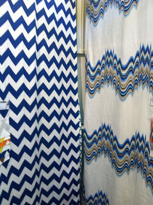
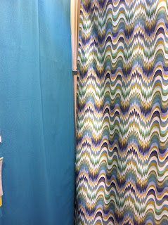
The PATTERNS, a collection of patterns that work nicely together from the chevron to the pots, the small repeats to the stripes and circles.  I can see combining several of these patterns in one room


                      Limitless Chevron with Distored, available in all of the colorways 


                 Solids with Wabash                                               The collection                                    


Third:
The TRIMS, vibrant and mimicking the fabrics all complementing one another.


Finally, the PRICE POINTS.  They are wonderful!

I have a client in mind whom I think will love this combination of colors and patterns.  I'm thinking... upholster a chair and ottoman in the tweed, the distorted pattern on an upholstered bench, the stripes on pillow shams over a solid coverlet and drapes out of the linen pots.  I'll need to add the trim somewhere, it's going to be spectacular.


Jonathan Adler's collection reflects "his colorful approach to design with linen and velvet featuring bright colors, modernist forms, bold graphic patterns and embroidery".

What do you think about the collection? I'd love to know, send me a message and share your thoughts.


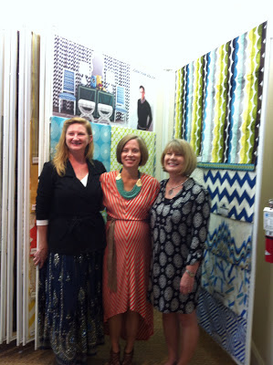
Thank you,  Brunschwig and Fils for sharing Jonathan Adlers for Kravet


Tuesday, October 23, 2012

Chevron, It's everywhere


                                                 Creative minds at work, High Point 2012                                                 


It's always so exciting to get ready for market, so much goes into it from my point of view as a designers.  First of all it's previewing lines, deciding who I'm going to see and  finally making a schedule and hoping I get to see everyone on my list.  Ultimately, it's planning on wearing the right shoes, they will either make or break your day.

Each time I visit market I try to look for reoccurring trends and I have to say that what I saw the most of was Chevron.  If your not familiar with the pattern, it is a series of V's and inverted V's.


  This beautiful sofa from Harden Furniture would be lots of fun in a game room. 


                   From settees to sofa's


It seems like everyone got into Chevron, from Jonathan Adlers new collection at Kravet, to bedding from Traditions linens, to the cover of the Lutron  brochure.


If you haven't started seeing Chevron everywhere, you will soon!


Thursday, September 27, 2012

Interior Design is so much fun


Whenever I tell people I am an Interior designer, they all say  "your job is so much fun" and it is, especially when I get to see new collections. 

I recently previewed the  Fall  Phillip Jeffries  Passport Collection.  Phillip Jeffries is a leading wall paper manufacturer of natural, textured and specialty wall coverings.
While the collection was being released, I was meeting with Connie their NC rep and received a personal presentation of the new Passport Collection.  I have to say, it's ABSOLUTELY Beautiful! I think the graphics and the pallettes are very chic.  I hope you will visit their website and fall in love with the unique "boldly scaled designs" of the Passport Collection.

Passport Collection


I'll share a few of the papers I fell in love with.

IMPERIAL GATES 
This was one of my very favorites, the color below is Dove & Taupe and this paper is available in 9 colorways.  I like the color palette and the bold graphics, it's classic yet contemporary


BOHEMIAN BANGLES is a series of large circles with each circle being 9.75".

            BOHEMIAN BANGLES 


CHINOIS OUR WAY  I love the updated look given to the Chinoiserie paper, the color combinations are just spectacular.


TEASE

Phillip Jeffries
         I loved the colors, crisp and fresh.
 
Tease is available in 9 colorways and is printed on Linen, Jute  and Manilla Hemp.

The paper is hand printed by Artisans in the US for a "unique handcafted effect".


CHAIN LINK  is available in 13 Colorways.  When I saw the orange photograph of Chain Link, I was reminded of a recent article I read that said Orange was the hottest color in the South East.


The papers are printed on natural fiber and therefore create a hand stenciled look with slight variations in the texture and color.  These variations are to be expected and are part of the natural beauty of handprinting on natural wallcoverings.  The art of hand-printed wallcoverings is what makes the papers so special.

By the end of our meeting, I just could not decide which one I liked best.  They are all so beautiful!  
Thank you Connie for sharing the Passport Collection from Phillip Jeffries with me.

I hope you love this collection as much as I did.  I can't wait to hear what you have to say.   Is there a particular paper you fell in love with? Let us know and share with us as to why it excites you.   

What's not to love about my job, I get to work with great people and share  the beautiful creations  available to all of us.  
                                                                        

Friday, September 7, 2012

DIY Secrets as seen in the Charlotte Observer


                  Thank YOU Charlotte Observer


                                                     Preserved Botanical Arrangements


 It's not everyday you get published in your local paper, but I was certainly thrilled to see my article featured on the top fold of September 1st Home & Garden section.
They called a few weeks ago and asked a couple of questions, if you didn't get a chance to see it in the paper,  I will share them with you.

What is your DIY secret weapon?
My DIY Secret weapon is always a great flower arrangement.  Whether as a centerpiece in a dining room or on a table in any room, flowers breath life and color into a space.  An elegant orchid placed in a beautiful container, an arrangement of fresh roses from your garden or preserved botanicals, I love bringing the outdoors in, adding life to every room.


These roses actually came from my garden and not only do they look beautiful, they also smell lovely.


There are two arrangements used in this dining room, the first is on the right and it's just a great looking large glass container with an over sized leaf and fabulous ornamental twigs.

The arrangement featured against the wall was made in a great looking copper pot and it is filled with a combination of herbs and plants and accented with a white pumpkin and great vine.   Always look for the best container, bring the outdoors in and let your imagination go. 

Take your room to the next level, it's all in the finishing touch.
If you find yourself out of great ideas, I am happy to help you.

To read the article visit Charlotte Observer